Lacking In Emotional Content The state of ralph emerson mcginnis
This online journal and blog is for anything that pops into my head while I'm not working on more important things. I'm a visual artist and writer. Read more about me here.
Vice is the epitome of (faux) irony, the magazine that most perfectly encapsulates the end of the 90s. Rich kid heterosexuals who have embraced the ironic humor of gay friends, yet who have no real understanding of an ironic state of being. The gay version of irony is to illuminate a bit of truth with a wink, the heterosexual Vice version is just to be an ass. Irony has been co-opted. But (true) irony is still viable, still powerful. Finally, we have Sleaze, the first breakout (English language) art/style mag of the 21st century.
Its not like me to gush but Sleaze is really rocking me out right now. It is by far the best designed, most fun to read style magazine of the moment. It seems to be doing what others posture to do embracing a true DIY, zine aesthetic, while still being highly refined. The zine influence got hardcore in the 90s, but most mags had lost their way, like Sleazenation. They pantomimed the look, but forgot the true ethos. Sleazenation did what most cool mags SHOULD do they scrapped it all and started over with Sleaze. Magazines have a very limited shelf life for capturing a zeitgeist lets face it, Rolling Stone should have ended at the very latest in 1979. The Face should have called it quits at the very latest in 1995. Sleazenation realized their time had passed; now theyre creating the future zeitgeist. Sleaze is post (faux) irony we can still want stuff, enjoy fashion and pop culture: but enough is enough, lets make a side note and get real; lets not be manipulated by gross materialism. Lets actually believe in something.
Sleaze merges style and content effortlessly, like a fabulous drag queen who has a lot to say, and says it well. Without a doubt, the May issue has the best cover Ive seen in recent memory. Its graphically beautiful, slick yet totally raw and punk. It says everything about the magazine. A true aesthetic masterpiece.
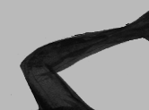
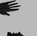
Sleaze limits blurbs and eschews portraits on their covers. This is a classic design choice, but in todays market, its revolutionary. Issue #3, Work Sucks, is a true graphic punch among the over-styled celebrities, lithe models and dreary typography we are presently bombarded with. However, Sleaze still cares about the power of glamour observe the models perfectly manicured, jungle-red nails. This isnt just some smelly, dull anarchist saying Work Sucks, This is a fabulous, put together young woman, whose beauty is being put to waste. Not only must she be relegated to a fluorescent-lit cubicle, an ugly dirty beige/cream monitor dominates her workstation. Office work dominates and destroys beauty, not only through the banality of tasks, but also through the oppression of environment. It is not enough for a fabulous person to fuck shit up; The object of her oppression must be transformed into a thing of beauty through its well-lit, artfully composed destruction.
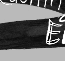
Cover blurbs are arranged as a classic grid in a digital typeface that seemed passé retro last year, but is now perfectly re-cast, seemingly as an afterthought on a neon international orange sticker - visually reminiscent of a Kinkos photocopied flyer. This sticker shows a healthy disrespect for the slickness of the magazine, which underlies all editorial content. This is what makes Sleaze a masterpiece of design as well as an adroit cultural observer: idea is king. There is a philosophy behind the look; it isnt just about arranging elements to look cool or about being practical. The old argument of form vs. content is irrelevant; at Sleaze, they are the same.